.svg)


Leveling up the expectations of everyone
Pernod Ricard is a brand that needs no introduction. As one of the world’s leading producers of wines and spirits, they manage an extremely rich portfolio of products — each with its own unique and beautifully crafted brand identity.
Their team reached out to us many years ago. They wanted us to help them with a QBR (quarterly business review) deck that just needed to look top notch. However, after this first project and what our team did, this collaboration turned into a partnership as various teams in Pernod Ricard started reaching out to us for presentation design help. The project number increased and with that, the criticality of the presentations we were helping them with.
Process
This success story is all about design. Unlike most projects, where we help shape the story before passing it to our design team, this one was all about making presentations that simply look right.

Design

Design adaptation

Animation

Final touches
Design
No matter which brand we're working with, the brand identity of the product has to stay intact. However, we were given complete freedom to refine the product’s identity whenever we saw an opportunity to make it work better in presentations.
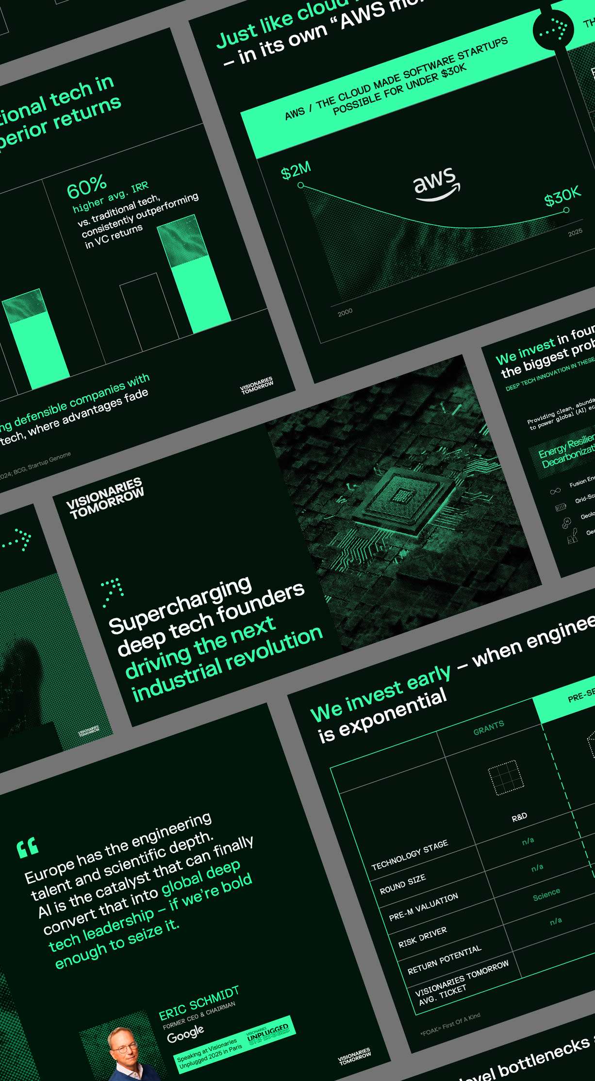
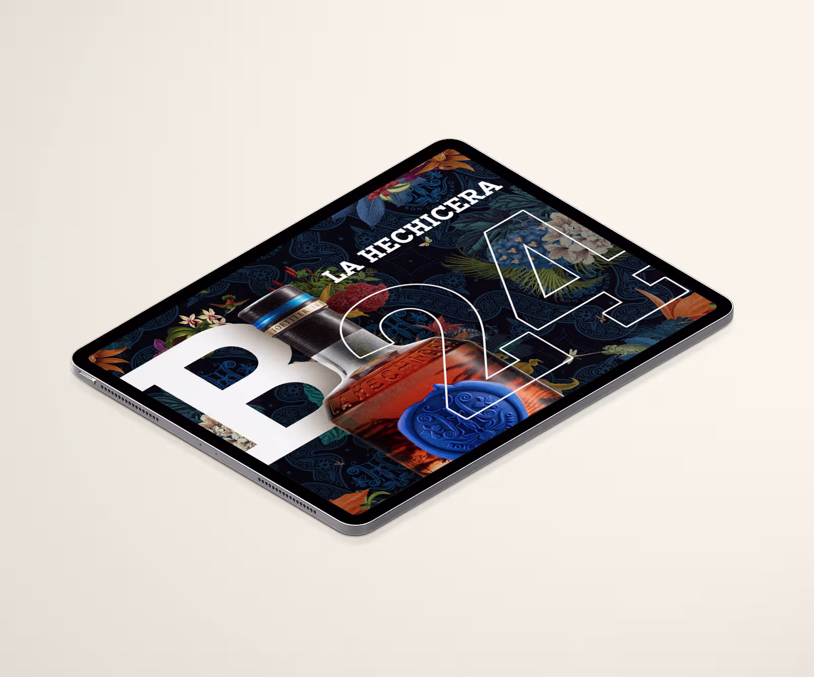
Chasing simplicity and clean designs is always a thing. That said, for these brands we also utilise the power of bold typography and mix it with premium photography and other visual elements. Those results are why the partnership grew from a single presentation to supporting the leadership team’s decks.
As more and more projects started coming our way, we also had to adapt to various screen sizes. One of those projects you can see here. A slightly wider (not ultra-wide but close) presentation that was used at an internal event of the sales teams. Our team worked closely with the production crew to ensure the slides fit perfectly on the custom-built LED wall. The design also had to account for moments when two presenters stood in positions that partially covered the screen.
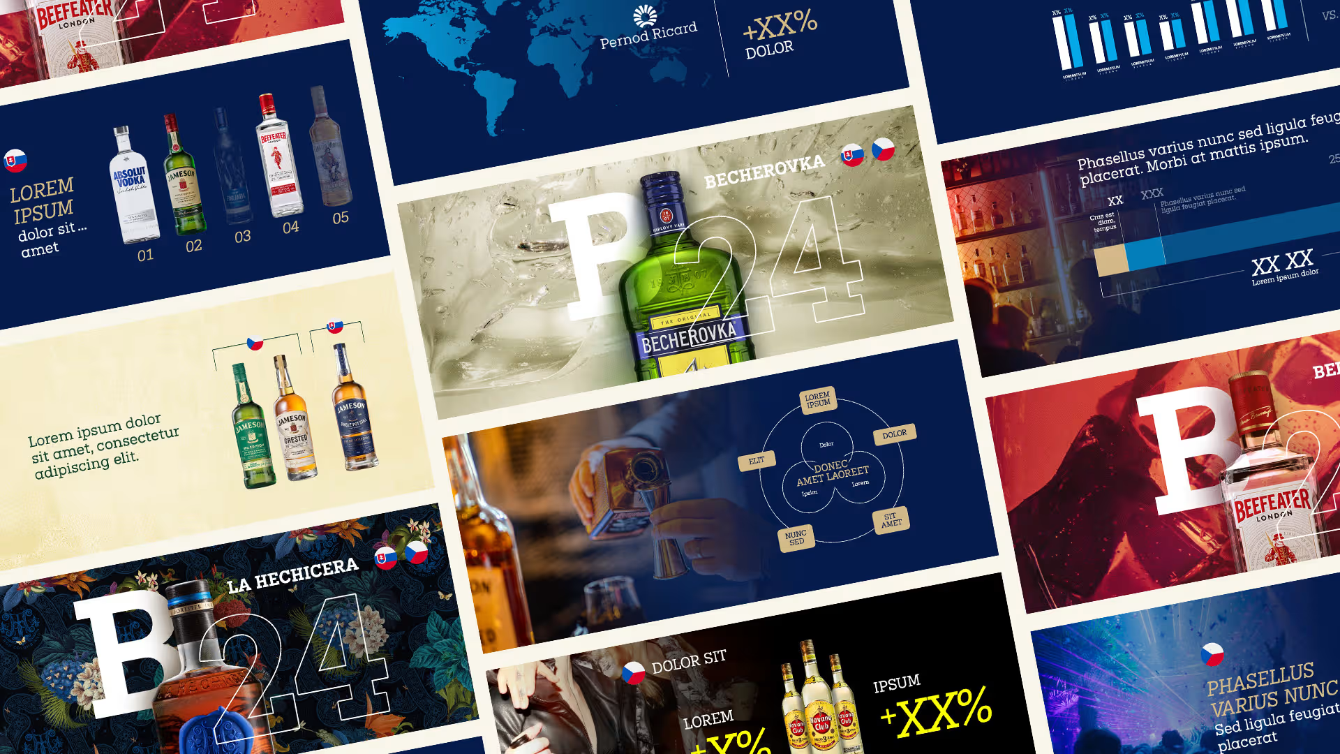
Our team loves pushing the limits of motion design and in every project with Pernod Ricard, we remained true to that approach. In these slides you can see some creative ways of utilizing the Morph transition but also a tons of advanced Motion Path animations.
As many of the presentations are heavy on data, it's of huge importance to make sure that we are presenting it in a consistent manner. Another important factor was keeping file sizes as small as possible, since many of the projects were presented online. The reason? Your presentation is being uploaded to the cloud and your audience is "downloading" it. Thus, the smaller the file, the smoother the experience they have.
The results
We are involved in many of the brand’s most important projects. Yet one of the things we love seeing as a result of our creative partnership is that the teams there not only appreciate the final result, but constantly ask for more. You know how it is — once you get used to the good stuff, it’s hard to go back.